Posts Tagged ‘Lucis Art Filter’
Port of Pensacola 1957 …


These two images were made in one of the warehouses that was located down at the Port of Pensacola back in the 1950’s. That is a fertilizer called ” Chilean Nitrate” that used to be shipped in and out of the Port. There are ten negatives or so in the negative envelope and I have only worked up these two. The two images above look as if they would have been printed on photographic paper… pretty much straight photographic prints. The two below are the same images, but I have also ran them through the Lucis Art Filter in Photoshop that I have talked about earlier in this blog. The details in the shadow parts of the image are brought out and parts of the image that you might overlook are brought to the fore-front.
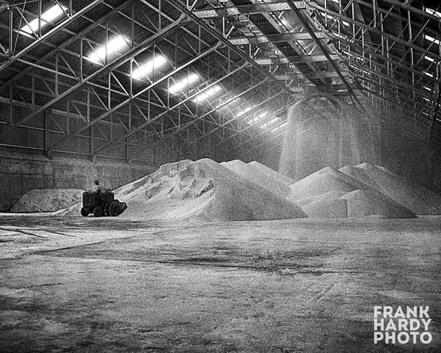

I like the contrast better in the second set of images, but really do not care for the guy filling the sack on the left side, so I might remove him in the future. The people in the photos add a sense of scale and you can tell how large the warehouse is. I have an image of it empty and I will post it once I have cleaned it up. Thanks for looking … I have been scanning new negatives that I have just recently found over the last few days ( several hundred ) and I will have a lot of new posts in the next few months. As usual, all comments are welcomed and appreciated … thanks again, Frank
Pensacola Dons Player ” Youngdahl ” …

This Dons player’s name was ” Youngdahl “. I do not know anything about what what position he played or any of his stats. The thing that is funny to me is the guy way in the back behind the fence … I do not know what he is doing or if he even knew that he was in the photograph, but I guess people have always been people in the background trying to make fools of themselves. Here is the same photo below that was worked on with the Lucis Art Filter …

The filter really accentuates the details in a b&w photo … the guy in the background and the ads on the back wall, along with the dirt in the outfield, all have a distinct and different look from just a straight b&w scan / print. Thanks for looking and commenting … I have been busy with other things and have not spent much time on this blog lately. I have found a stack of negatives that I found years ago, but put somewhere so that I would not lose them and ended up miss-placing them until a week ago. I have not scanned any of the negative s and I plan to do so in the next few weeks, please check back. Thanks again for looking … Frank
Jarrard Motors …

This is the last of these old photos that I have posted before, but ones I have run through the Lucis Art Filter. If you run a search you should be able to find the original photo in the first post. I personally like the look this filter gives, however I am not going to take the time to do all of these photos. Only the ones that have detail that this filter enhances. Thanks for looking and as usual, all comments are appreciated … Frank
Machine at Mill …

I do not know what type of mill, the negative envelope did not mention where this was taken. It could really be anywhere or any type of mill. The negative is extremely sharp and you can read all the numbers on the gauge and the lettering on the various parts of the machine. It is too bad that the internet cannot match the sharpness and let you read the writing, but you can see the texture of the wood and metal in the image. This image was run through the Lucis Art Filter. Thanks for looking and please check back … Frank
Son Motors …

Here is another image that I found in another ” Son Motors ” negative envelope. After cleaning it up in Photoshop, it looked good but nothing too interesting. So I ran it through a Lucis Art Filter to bring out all of the detail under the car, the brick wall, the attendant’s uniform and the equipment along the back wall. I think that it gives images like this a different look and feel and makes the image more interesting to look at. As usual, I have no clue who the man is. I have several more images that I have put this effect on that I am going to post in the near future, so please check back. Thanks for looking … Frank
Mount Rushmore II …

Here is one more of Mount Rushmore that I thought that I would post. It was made back in the early 1950’s when my father made the other that I posted some time ago. This one I left almost full frame and did not bother cropping out the people on the bottom left … I thought that they added some sense of scale to the photo. I also ran the file through the Lucis Art Filter to bring out the detail in the rock and the stone. The blueish color was added by me. No, I was not trying to make this resemble a cyanotype … I just like blue “cool” mono-colored images. I also did not bother taking out the lens flare in the top left corner. Thanks for looking and as usual, all comments are appreciated … And thanks for checking back … Frank

You must be logged in to post a comment.